

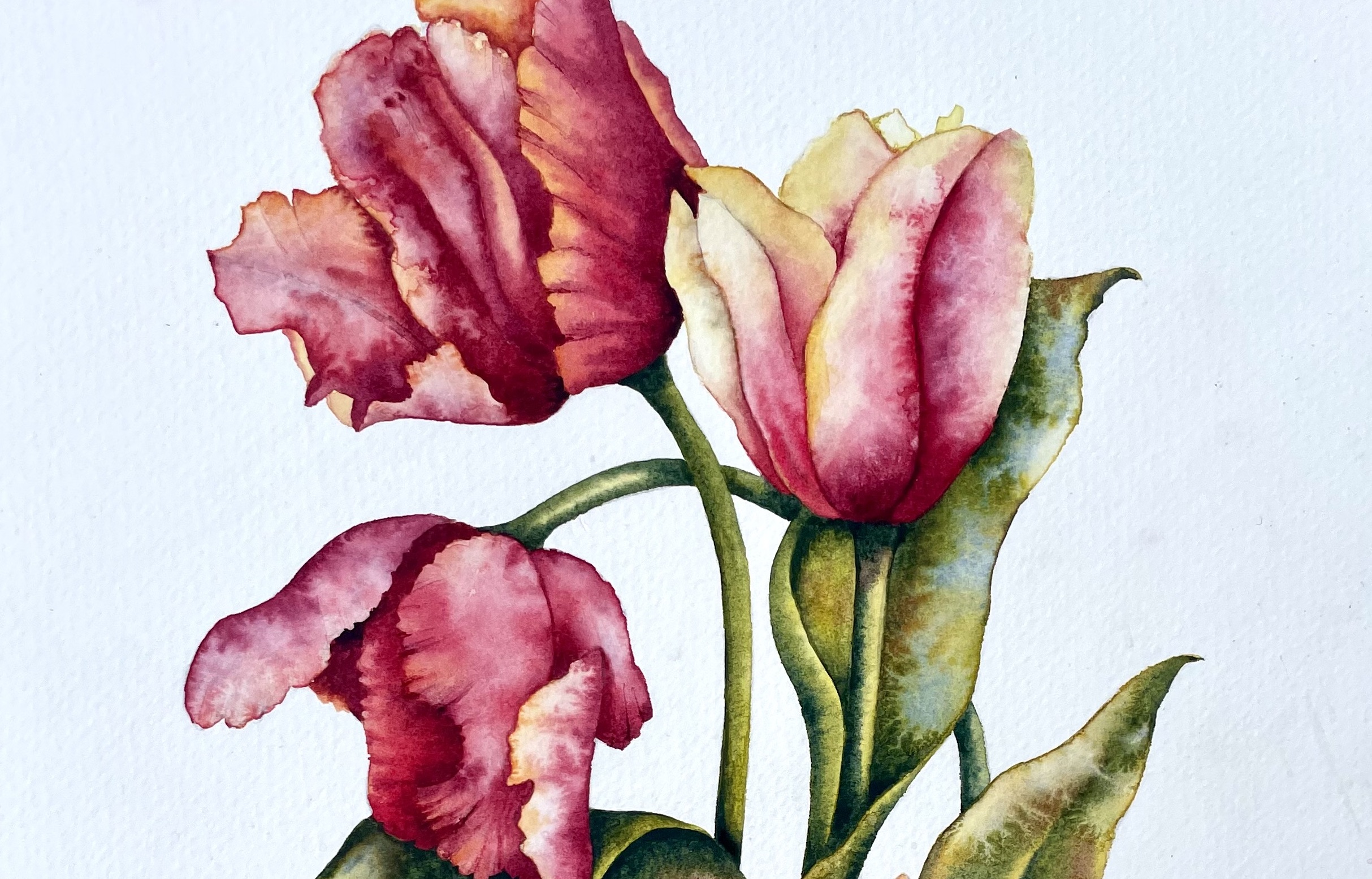
Painting flowers in watercolour can sometimes feel rather daunting. There are so many petals, overlapping shapes, subtle colour changes and little details that it is easy to become overwhelmed before you’ve even started!
But it doesn’t have to be complicated.
One of my favourite ways to approach painting flowers is to simplify the subject and concentrate on the individual shapes that make up the flower. Rather than trying to paint the whole thing in one go, I break it down into smaller, manageable sections.
For this demonstration, I’ve chosen Parrot Tulips. Their open petals, beautiful colours and slightly irregular shapes make them a wonderful subject for watercolour painting.
Here are a few tips to help you approach your own flower paintings with confidence.
1. Choose a flower with simple, open petals
If you’re relatively new to painting flowers, choose something that has clearly defined petals and an open structure.
Tulips and lilies are particularly good subjects. Their petals are generally easy to identify and can be separated into individual shapes.
I would avoid something like a carnation initially. Although beautiful, its many frilled and overlapping petals can make it a much more complicated subject to tackle.
The secret is to choose a flower that allows you to see exactly where one shape ends and another begins.
2. Simplify your drawing into individual shapes
This is probably the most important part of the process.
Rather than drawing what you think a flower should look like, really look at the shapes in front of you.
Try to identify each individual petal and draw its outline as accurately as you can. You may find that what initially looks like one complicated leaf or petal is actually made up of several distinct shapes.
For example, one leaf might be broken down into four separate sections, each with its own direction, tone and colour.
Once you have identified these shapes, you can paint each one individually, allowing the flower to develop gradually.
This approach gives you much more control and makes the whole process feel far less intimidating.
3. Don’t be afraid of your darker colours
One of the things that can make a flower painting look rather flat is a lack of contrast.
It’s tempting to keep all your colours quite watery and delicate, but you really do need some stronger tones to make the individual petals stand out.
My tip is to mix your darker colours to a much thicker consistency, think of single cream rather than milk!
These stronger mixtures will give you the depth and contrast needed to distinguish one petal from another.
Look carefully at where the shadows fall and where one petal overlaps another. These are the areas where your darker mixtures will work particularly well.
Remember, watercolour relies on the relationship between light and dark. Don’t be frightened of using those stronger tones!
4. Creating delicate veins with a pin
Some flowers have beautiful veins running through their petals and leaves. Painting these individually with a fine brush can sometimes look a little forced.
A simple alternative is to try scratching the veins into a wet wash.
Using a pin or something similarly fine, gently scratch a line into the wet paint. This slightly damages the surface of the paper, creating a tiny channel into which the pigment can seep.
As the paint settles, you are left with a delicate darker line.
A word of caution: be gentle! You only want to scratch the surface of the paper, not cut through it. Try this on a scrap piece of paper first so you can get a feel for the technique.
5. Using clear water to create interesting textures
This is one of my favourite little watercolour tricks.
For some added texture, I like to drop small blobs of clear water into individual petal shapes while the paint is still wet.
The clear water pushes the pigment away, creating what we often call runbacks or cauliflower blooms.
The pigment moves towards the edges of the shape, sometimes leaving a subtle darker outline.
These little accidents can create beautiful variations in tone and texture, particularly in flower petals.
The important thing is to experiment with the timing. If the wash is too wet, the effect may be very subtle. If it has begun to dry, you may get a much more pronounced bloom.
There is no need to create this effect on every petal. Sometimes a little goes a long way!
6. Keep your background simple
Finally, I often prefer to leave the background of a flower painting completely white.
With colourful flowers such as these Parrot Tulips, the white paper provides a lovely contrast and allows the colours to stand out.
It also avoids introducing unnecessary distractions. The flowers themselves become the focus of the painting.
Of course, this is a personal choice, but I think it’s worth remembering that you don’t always need to fill every part of the paper.
Sometimes leaving things out is just as important as putting them in!
A little encouragement before you start
If there is one thing I’d like you to take away from this demonstration, it is that painting flowers doesn’t need to be complicated.
Start with a simple flower, look for the individual shapes and work on them one at a time. Build up your darker tones gradually and don’t be afraid to experiment with the wonderful effects that watercolour can produce.
You might be surprised at just how manageable a seemingly complicated flower can become.
Happy painting!
Ruth Clayton