

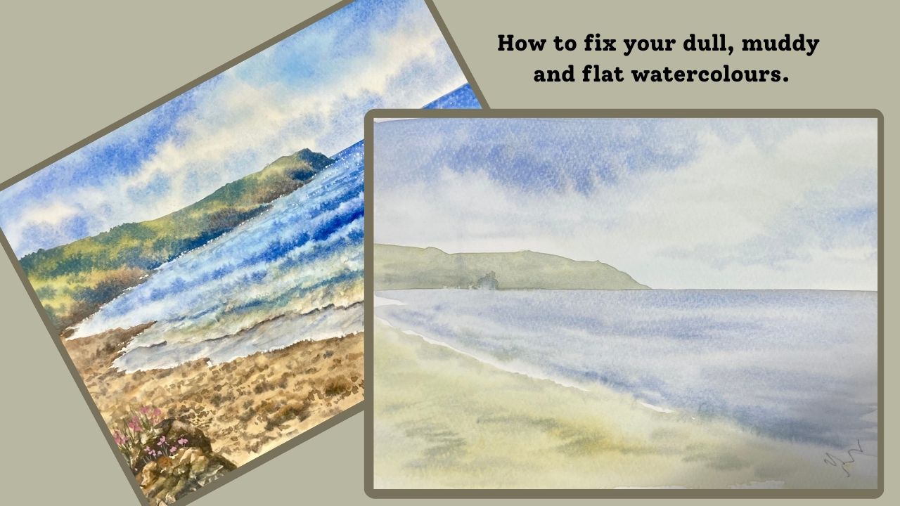
One of the most common frustrations for watercolour artists is completing a painting only to find that it lacks impact. Perhaps the colours seem muddy, the composition feels uninteresting, or the painting simply doesn’t have the sense of depth that we were hoping to achieve.
In my latest YouTube video, I explore some of the reasons why watercolour paintings can appear dull and flat, and demonstrate a few simple ways to improve them.
To illustrate the point, I began by showing two deliberately poor examples. The first painting was dark and muddy, with colours that lacked freshness and clarity. The second was the opposite , pale, insipid and rather lifeless, with very little tonal contrast to engage the viewer.
By examining these examples, it became easier to identify some of the common pitfalls that many of us encounter when painting.
The Importance of Tone
One of the key areas I discussed was tonal value. A painting can have beautiful colours, but without a good range of tones it can still appear flat.
To demonstrate this, I photocopied the paintings in greyscale. Removing the colour allows us to judge the underlying tonal structure more objectively. The weaker paintings showed very little variation between light and dark areas, whereas the revised version contained a much broader tonal range, helping to create depth, focus and visual interest.
This is a useful exercise for any artist. Looking at your work in black and white can quickly reveal whether your painting has sufficient contrast.
Improving the Composition
Another change I made was to raise the horizon line. The original composition divided the picture space rather awkwardly and lacked a strong sense of structure.
By adjusting the horizon and thinking more carefully about the arrangement of shapes within the painting, the scene immediately became more engaging. Small compositional changes can often make a significant difference to the overall success of a painting.
Using Colour and Contrast More Effectively
Many watercolour paintings fail because artists are hesitant to use stronger darks. Without these darker values, everything sits within a narrow tonal range and the painting can appear washed out and lacking in depth.
In the demonstration, I introduced richer colours and stronger dark areas to create contrast. These darker areas helped the lighter sections to shine and gave the painting greater visual impact.
Contrast is one of the most powerful tools available to artists. Light only appears bright when it is placed alongside darker tones.
Creating Depth Through Distance
A convincing landscape usually benefits from a clear distinction between foreground, middle ground and background.
In the revised painting, I paid particular attention to these three areas:
Foreground: More detail, stronger contrasts and warmer colours helped bring this area forward.
Middle Ground: Shapes became slightly softer and less defined, acting as a bridge between the foreground and the distance.
Background: Cooler colours, softer edges and reduced detail helped create the illusion of atmospheric perspective and distance.
These simple adjustments can dramatically improve the sense of space within a painting.
A Useful Sketchbook Exercise
Although I eventually overworked my demonstration painting, it was never intended to become a finished piece. Its purpose was as a sketchbook study and teaching exercise.
Sometimes these exploratory paintings are among the most valuable. They allow us to experiment, make mistakes and better understand the principles that contribute to a successful painting.
The exercise clearly demonstrated how composition, tonal contrast, colour choices and atmospheric perspective all work together to create a more engaging watercolour.
If you’ve ever felt that your paintings look dull, muddy or flat, I encourage you to watch the video and try some of these ideas for yourself. Often it only takes a few thoughtful adjustments to transform a painting from uninspiring to full of life and depth.